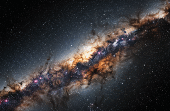
Imagine gazing up at the night sky. A seemingly infinite tapestry of twinkling lights, each a distant sun. For centuries, humanity has wondered about these celestial bodies. Are they all the same? Or are there different kinds, each with its own story? The answer, as astronomers discovered, is a resounding yes. Stars come in a dazzling array of sizes, temperatures, brightnesses, and ages. Making sense of this cosmic zoo required a powerful organizational tool, and that tool is the Hertzsprung-Russell diagram, often simply called the HR diagram.
A Cosmic Census: The Need for Order
Before the early 20th century, astronomers had amassed a significant amount of data about stars. They could measure their apparent brightness (how bright they look from Earth), estimate their distances (a tricky but crucial task!), and analyze their light to determine their surface temperatures and chemical compositions. However, this data was like a pile of puzzle pieces without the box lid picture. It was clear that stars weren’t all identical, but the underlying relationships between their properties were not immediately obvious.
Two astronomers, working independently around the 1910s, Ejnar Hertzsprung in Denmark and Henry Norris Russell in the United States, began to plot these stellar properties against each other. They were particularly interested in the relationship between a star’s true brightness (its luminosity) and its surface temperature (or spectral type, which is closely related to temperature and color). When they plotted these two characteristics, a surprisingly orderly pattern emerged, revealing fundamental truths about the lives of stars.
Charting the Stars: Understanding the HR Diagram’s Axes
The HR diagram is essentially a scatter plot, but one of profound significance in astrophysics. Each dot on the diagram represents a single star.
The Vertical Axis: Luminosity Unleashed
The vertical axis of the HR diagram represents a star’s luminosity. Luminosity is the total amount of energy a star radiates into space per unit of time. Think of it as the star’s intrinsic wattage. It’s not just how bright a star appears from Earth (that’s apparent magnitude, which depends on distance), but how truly powerful it is. Luminosity is often expressed in terms of the Sun’s luminosity; for instance, a star might be 100 times more luminous than the Sun or only 0.01 times as luminous.
Stars at the top of the diagram are highly luminous, pouring out vast amounts of energy. Stars at the bottom are much dimmer, with far lower energy outputs. It’s important to note that a star can be very luminous for two main reasons: either it’s incredibly hot, or it’s very, very large (or both!). The HR diagram helps us disentangle these effects.
The Horizontal Axis: Temperature, Color, and Spectral Class
The horizontal axis typically represents a star’s surface temperature. Astronomers often use spectral class as a proxy for temperature, as the two are directly related. Confusingly for newcomers, on most HR diagrams, temperature decreases as you move from left to right. So, the hottest stars are on the left, and the coolest stars are on the right.
Temperature also dictates a star’s color. Hot stars (30,000 Kelvin or more) shine with a brilliant blue or blue-white light. Cooler stars (around 3,000 Kelvin) appear reddish. Our Sun, with a surface temperature of about 5,800 Kelvin, is a yellowish-white star. The spectral classes, a sequence of letters O, B, A, F, G, K, M (often remembered by the mnemonic “Oh Be A Fine Girl/Guy, Kiss Me”), categorize stars from hottest (O-type) to coolest (M-type). So, moving from left to right, you’d go from O stars, through B, A, F, G, K, and finally to M stars.
The Hertzsprung-Russell diagram fundamentally plots stellar luminosity against surface temperature. This graphical tool revolutionized astronomy by revealing distinct groupings of stars. These groupings correspond to different stages in a star’s life cycle and different physical characteristics, such as size.
The Main Neighborhoods: Key Regions of the HR Diagram
When stars are plotted on the HR diagram, they don’t scatter randomly. Instead, they fall into distinct regions, each telling a part of the stellar story.
The Main Sequence: The Stellar Highway
The most prominent feature on the HR diagram is a diagonal band stretching from the upper left (hot, luminous stars) to the lower right (cool, dim stars). This is called the Main Sequence. Approximately 90% of all stars, including our Sun, reside on the main sequence. These are stars in the prime of their lives, stably fusing hydrogen into helium in their cores. This fusion process is what generates their energy.
For main-sequence stars, there’s a direct correlation: the hotter they are, the more luminous they are. This is because hotter main-sequence stars are also more massive. A more massive star has greater gravitational pressure in its core, leading to higher core temperatures and much faster fusion rates, hence higher luminosity. An O-type star on the main sequence might be tens of times more massive than the Sun and tens of thousands of times more luminous. Conversely, an M-type main-sequence star (often called a red dwarf) might have only a fraction of the Sun’s mass and be thousands of times less luminous.
Giants and Supergiants: The Luminous Elders
Located above the main sequence are the giant and supergiant stars. These stars are significantly more luminous than main-sequence stars of the same surface temperature. How can a relatively cool star (like a red giant) be so bright? The answer lies in their sheer size. The Stefan-Boltzmann law tells us that the total energy radiated by an object is proportional to its surface area and the fourth power of its temperature. So, if a star is cool but has an enormous surface area, it can still be incredibly luminous.
Giants and supergiants are evolved stars that have exhausted the hydrogen fuel in their cores. They have moved off the main sequence and are now fusing hydrogen in a shell around the core, or they might be fusing heavier elements. Red giants, like Betelgeuse (though it’s often classified as a supergiant) or Aldebaran, are cool (K or M type) but very large and therefore luminous. Blue giants and supergiants are hot, incredibly large, and fantastically luminous – some of the brightest stars in the universe. These stars are typically much more massive than sun-like stars and live very fast, short lives.
White Dwarfs: The Compact Remnants
In the lower-left corner of the HR diagram, you’ll find the white dwarfs. These are peculiar objects: they are very hot (hence their position on the left side of the diagram) but also very dim (placing them at the bottom). The only way this combination is possible is if they are incredibly small – typically about the size of the Earth!
White dwarfs are the dense, collapsed cores of low-to-medium mass stars (like our Sun) that have exhausted all their nuclear fuel. They no longer generate energy through fusion. They are hot because they retain the residual heat from their earlier, more active phases. Over billions of years, they will gradually cool down and fade away, eventually becoming cold, dark “black dwarfs” (though the universe isn’t old enough for any to have formed yet). Their luminosity is low simply because their surface area is tiny.
Luminosity: The Key to Unlocking Stellar Secrets
As we’ve seen, luminosity is a crucial parameter in the HR diagram. It’s one of the two primary coordinates, and it directly helps us understand a star’s physical state and evolutionary stage. Without considering luminosity, a hot blue star could be a young, massive main-sequence star, an evolved blue supergiant, or a dying white dwarf. It’s the luminosity that distinguishes them.
For instance, a star with a surface temperature of 10,000 K (an A-type star) could be:
- A main-sequence star like Sirius A, with a luminosity about 25 times that of the Sun.
- A white dwarf like Sirius B, with a luminosity only about 0.026 times that of the Sun, despite being hotter than Sirius A’s surface.
- Potentially, if it were a giant (though A-type giants are less common than G, K, M giants), it would be significantly more luminous than its main-sequence counterpart.
Astronomers even use luminosity classes to further refine stellar classification based on their HR diagram position. These are Roman numerals (I, II, III, IV, V, VI, VII) added to the spectral type. For example:
- I: Supergiants (further subdivided into Ia, Iab, Ib)
- II: Bright giants
- III: Normal giants
- IV: Subgiants (stars transitioning from the main sequence to become giants)
- V: Main-sequence stars (often called “dwarfs,” though this can be confusing with white dwarfs)
- VI: Subdwarfs (rarer, less luminous than main-sequence stars of the same spectral type)
- VII (or D): White dwarfs
So, our Sun is a G2V star: a G-type spectral class, luminosity class V (main sequence). Betelgeuse is an M1-M2Ia-Iab: an M-type spectral class, luminosity class I (supergiant).
A Roadmap of Stellar Lives
Beyond just categorizing stars as they are now, the HR diagram is an invaluable tool for understanding stellar evolution. Stars don’t remain static in one position on the diagram throughout their entire existence (except for their long tenure on the main sequence). As they age, consume their fuel, and change their internal structure, their surface temperature and luminosity change, causing them to “move” on the HR diagram.
A star like our Sun, for example, was born from a collapsing cloud of gas and dust. As it contracted and heated up, it moved onto the main sequence. It will spend about 10 billion years there. When it exhausts the hydrogen in its core, it will expand and cool at the surface, becoming a red giant. This means it will move upwards and to the right on the HR diagram. After this phase, it will shed its outer layers (forming a planetary nebula), and its core will collapse to become a white dwarf, moving it to the lower-left of the diagram. More massive stars follow different, more dramatic evolutionary paths, often ending their lives as supernovae and leaving behind neutron stars or black holes, which also have their (less clearly defined) places relative to the diagram.
By plotting star clusters (groups of stars born at roughly the same time), astronomers can see these evolutionary tracks in action. The most massive stars in a cluster evolve off the main sequence first, allowing astronomers to determine the cluster’s age by looking at the “main-sequence turn-off point.”
More Than Just a Chart
The Hertzsprung-Russell diagram is far more than a simple graph. It’s a cornerstone of modern astrophysics. By classifying stars based on their luminosity and temperature, it unlocked fundamental patterns in stellar properties and provided a framework for understanding how stars are born, how they live, and how they die. It beautifully illustrates the underlying physics that governs these celestial powerhouses and continues to be an essential tool for astronomers studying the vast and varied population of stars in our universe and beyond. It shows us that even in the immense complexity of the cosmos, there is an underlying order, a story waiting to be read in the light of the stars.